Wednesday, 9 April 2014

Evaluation Question 5

How did you attract/address your audience?

Having conducted my planning and research in accordance with the reader profile I felt confident in making my magazine product appealing to my target audience. 

Having adapted my work in accordance with the reader profiles I believe that my product would be attractive to my audience. I undertand that not a wide majority of my audience enjoy exactly the same music, bands or artists which is why I have incorporated a range of different features in order to entice them all, I feel that I needed to conduct more audience research than what I had done, because this would've allowed me to understand more about my target audience and I would have been able to feature different aspects of this research onto my magazine. 

Thursday, 3 April 2014

Evaluation Question 7

Progression - College magazine to Music magazine


It is clear that throughout the course I have made some progression, with Photoshop and with the general styling of each magazine. I have learnt a lot about the conventions of already established magazines and applied them to my music magazine as the year has progressed.
I also feel that my music magazine looks a lot more professional than my college one. Mainly because it is more neatly set out and the house style is more suited to the genre, whereas my college magazine is a bit 'all over the place' and there is no established house style. I have developed both my knowledge and creativity throughout the course as shows above in the comparison.
My main help through the creation of my music magazine was looking at established magazines and even just on Google images to compare mine and other magazines and find things that I could improve on. I think the induction assignment was very helpful and is still helpful when putting together this evaluation because I can compare and contrast against my initial knowledge and creativity, and the effort I put into my final draft of my music magazine.

I particularly use the 'quick selection' tool in order to ensure that I have got a picture with no background in order to create a sense of a professional product that would appeal to the correct target audience as the existing products that I researched in order to plan the process of the creation of my product. The house style has improved from the preliminary task to the music magazine and I feel that these are conventions that I have built upon myself as a result of research, planning and creating my own product. I began the course with limited knowledge in regards to Photoshop, Blogger and even the cameras we were given, which I felt put me at an advantage because when it came to the creation of my product I was able to develop my understanding and knowledge on this software and I would have a lot to include in my evaluation about the process I had to follow in order to create my product.
I managed to angle the photo in a more effective way on my music magazine because of the camera use for my college magazine, this therefore makes my product look more professional and conforms with existing products. Completing the preliminary task also allowed me to have some experience of research and planning which helped me to further develop ideas for my music magazine.

Wednesday, 19 February 2014

Double Page Spread Draft


This is my first draft of my double page spread. I have kept the house style the same but added a different colour to make the page look less dull. The story is one that links with Nirvana and is about The Rock Saints (featured band) performing a cover of 'Smells Like Teen Spirit' by Nirvana and getting hate for it. The story is different to one I've read in established magazines, however the headline style of blackmail writing was used on an NME magazine featuring Lily Allen.

Monday, 10 February 2014

Contents Page - Draft


          This is my first draft of my contents page. I have kept the house style that I initially decided to use because the connotations of the colours re-enforce the Rock genre that I have chosen. Red connotes danger in this sense because rock music generally sounds angry and dangerous, yellow connotes caution in this context because of the colour being used on caution tape and on warning signs. I think the yellow adds more depth to the magazine as it stand out compared with the black and red. Finally the black connotes darkness which again connotes danger because people are usually scared of the dark.

Tuesday, 14 January 2014

Example Contents taken from Kerrang

           This is an example of a contents page from Kerrang magazine which shares the same genre as my music magazine. The langauge of this contents page includes content such as the pictures of the bands that will feature further on in the magazine.The pictures are placed in a neat style which connotes a plain and simple genre which may not re-enforce the correct genre. The house style is also something that I would like to incorporate on my product so that it is obvious that it shares the genre of existing products such as Kerrang and NME.

Monday, 13 January 2014

Final draft

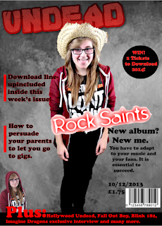
           This is my final draft of my music magazine. I have used the house style that I planned to use in order to link my final draft to my planning. I will be reconsidering the layout in the final design of my front cover. I think that this will allow me to be more space efficient and allow my magazine cover to look better and more professional, I will include changes such as making the plug look more like part of the magazine i.e making the background grey instead of black in order to make it stand out a little bit less and make it look like it is part of the magazine. I will use a different photo of a different person in the bottom left corner to provide more variety on the cover in order to entice people further. I placed the masthead slightly behind the models head because it attracts more attention to the model and also looks more professional because in my research I found that many magazines similar to my own also shared this particular convention so I decided that this would be the best thing to do.
           I used a footer to further entice people to my magazine as well. I also overlapped the larger font saying 'Plus:' with the photo of the model in the bottom left corner. I used the black background for the footer to emphasise the red font colour that I used to show the extras included in the magazine. I used the same font for everything on the cover apart from the masthead and the main headline. I did this because it creates a sense of continuity in the cover and it makes it again, look more professional. In my research I found that lots of other similar magazines to my own used the same theory and used the same font on the majority of the front cover. The main colours that I have used are unisex which allows my magazine to appeal to both genders therefore expanding my target audience.