This is my first draft of my double page spread. I have kept the house style the same but added a different colour to make the page look less dull. The story is one that links with Nirvana and is about The Rock Saints (featured band) performing a cover of 'Smells Like Teen Spirit' by Nirvana and getting hate for it. The story is different to one I've read in established magazines, however the headline style of blackmail writing was used on an NME magazine featuring Lily Allen.
This is my first draft of my contents page. I have kept the house style that I initially decided to use because the connotations of the colours re-enforce the Rock genre that I have chosen. Red connotes danger in this sense because rock music generally sounds angry and dangerous, yellow connotes caution in this context because of the colour being used on caution tape and on warning signs. I think the yellow adds more depth to the magazine as it stand out compared with the black and red. Finally the black connotes darkness which again connotes danger because people are usually scared of the dark.
This is an example of a contents page from Kerrang magazine which shares the same genre as my music magazine. The langauge of this contents page includes content such as the pictures of the bands that will feature further on in the magazine.The pictures are placed in a neat style which connotes a plain and simple genre which may not re-enforce the correct genre. The house style is also something that I would like to incorporate on my product so that it is obvious that it shares the genre of existing products such as Kerrang and NME.
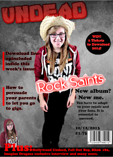
This is my final draft of my music magazine. I have used the house style that I planned to use in order to link my final draft to my planning. I will be reconsidering the layout in the final design of my front cover. I think that this will allow me to be more space efficient and allow my magazine cover to look better and more professional, I will include changes such as making the plug look more like part of the magazine i.e making the background grey instead of black in order to make it stand out a little bit less and make it look like it is part of the magazine. I will use a different photo of a different person in the bottom left corner to provide more variety on the cover in order to entice people further. I placed the masthead slightly behind the models head because it attracts more attention to the model and also looks more professional because in my research I found that many magazines similar to my own also shared this particular convention so I decided that this would be the best thing to do.
I used a footer to further entice people to my magazine as well. I also overlapped the larger font saying 'Plus:' with the photo of the model in the bottom left corner. I used the black background for the footer to emphasise the red font colour that I used to show the extras included in the magazine. I used the same font for everything on the cover apart from the masthead and the main headline. I did this because it creates a sense of continuity in the cover and it makes it again, look more professional. In my research I found that lots of other similar magazines to my own used the same theory and used the same font on the majority of the front cover. The main colours that I have used are unisex which allows my magazine to appeal to both genders therefore expanding my target audience.
An example of my work before it is finished to show my initial ideas of what the magazine will look like to some extent. I think I will change the colour of the masthead to make it clearer and add to my house style ideas in order to create my final piece to the best of my ability.
This is an example of a posed shot which would be good for a magazine cover because the whole body is shown and I could blend the picture in to the other conventions of my magazine and it would look more professional that a picture that has been cut off.


